Earthora
Luxury in Every Crunch
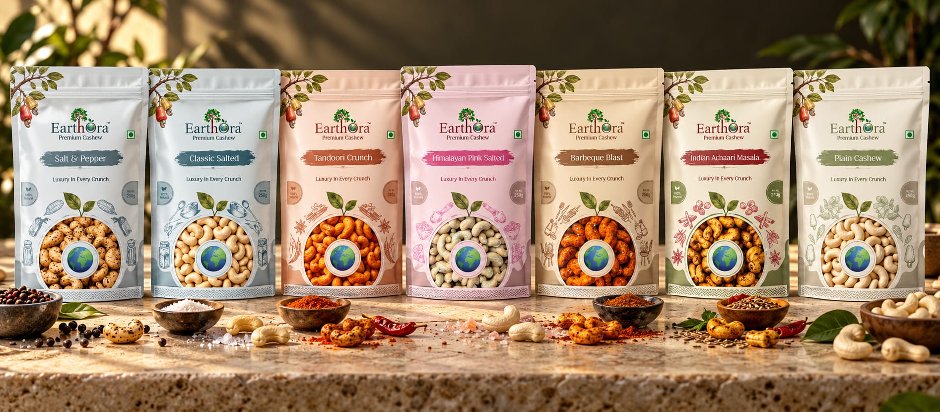
Earthora’s packaging brings seven cashew flavours together through a consistent visual identity.
The Brand Concept
Earthora’s packaging brings seven cashew flavours together through a consistent visual identity. The design combines botanical illustrations, soft colours, and elegant typography to express the brand’s premium positioning while giving each flavour its own character.
The Creative Concept
The visual concept connects nature with everyday indulgence. Cashew fruit and leafy illustrations reference the product’s origins, while spacious layouts and restrained colours support a refined appearance.
A recurring circular motif and globe illustration create a shared visual signature across the range.
The Design Challenge
The challenge was to balance brand consistency with flavour differentiation. Every pack needed to feel part of the Earthora family, while helping customers recognise the individual variety.
The packaging also needed to communicate the idea behind “Luxury in Every Crunch” through its visual presentation.
The Design Outcome
The result is a coordinated family of seven front-panel designs. Consistent composition builds a recognisable identity, while changes in colour and illustration give each flavour a distinct expression.
The packaging presents Earthora through three central ideas: natural origins, flavour variety, and everyday luxury.