Antique Cannon
Game Asset
Exploring form, materials, and efficient asset production.
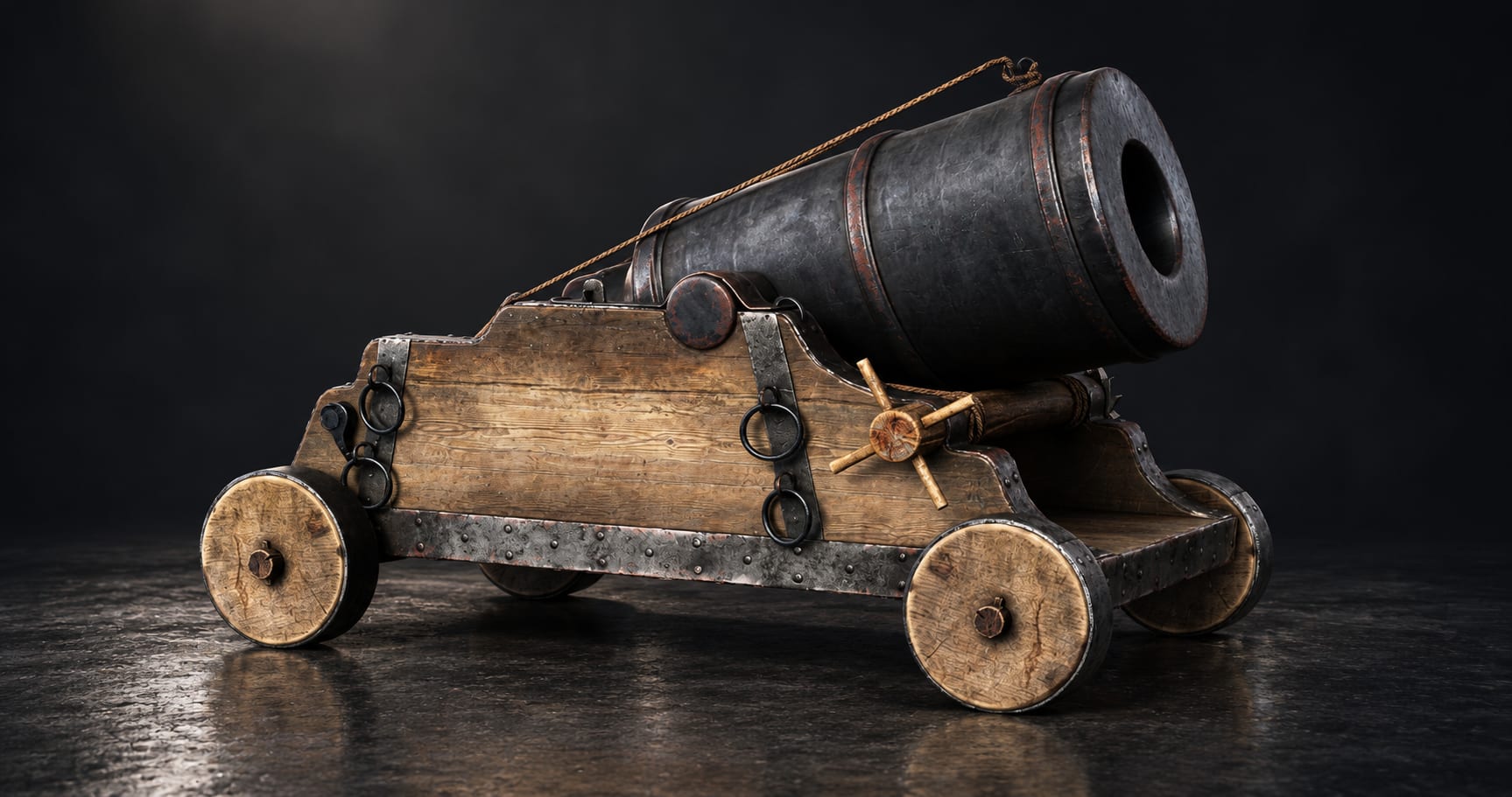
A convincing game prop needs a clear silhouette, believable construction, and materials that communicate its history. This case study explores those priorities through an antique cannon with a wooden carriage, solid disc wheels, iron fittings, and rope details.
The presentation follows the asset from concept exploration to final rendering. Concept and process illustrations reconstruct the design journey around the finished model.
01 — Initial Concept Exploration
How do you explore ideas without losing the asset’s identity?
Rough sketches help test the relationship between the barrel, carriage, and wheels before focusing on smaller details. Different proportions and viewpoints reveal which shapes feel balanced and which need adjustment.
Outline-only drawing keeps this stage quick and readable. Without shading, the silhouette and proportions must do the work.
Key lesson: Change one major proportion at a time so each sketch answers a clear design question.
02 — Refined Concept Design
How do you make a design consistent from every angle?
Front, side, rear, and three-quarter drawings help clarify how the components relate to one another. The side view communicates the overall proportions, while front and rear views help explain width and alignment.
Using concept angles different from the final renders also reveals parts of the asset that a single hero image may hide.
Key lesson: A strong concept should explain the object beyond its most flattering camera angle.
03 — Color and Material Planning
How do you keep different materials visually distinct?
The palette separates warm timber, dark iron, and lighter rope. Hand-applied color studies help test that balance before introducing realistic surface detail.
The challenge is to create variation without making every component compete for attention. Broad material differences should remain readable even when the asset appears small.
Key lesson: Establish material contrast first, then add subtle color variation.
04 — Blockout and Proportion
Why start with simple geometry?
A blockout establishes the barrel’s scale, the carriage’s height, and the spacing of the wheels. Simple forms make proportion changes easier to assess before detailed modeling begins.
Checking the silhouette from several directions helps identify problems that might remain hidden in one perspective.
Key lesson: Resolve the large shapes before investing time in small details.
05 — Shape Refinement
How do basic forms become believable construction?
Refinement develops the stepped carriage, barrel profile, wheel thickness, and supporting elements. The main challenge is keeping each component consistent with the original design while making their connections visually clear.
Inspecting the model from close and distant views helps balance accurate construction with a readable overall shape.
Key lesson: Each component should feel connected to the structure around it.
06 — Surface Detail
Where should detail be concentrated?
Fittings, edges, rings, and surface wear give the prop character. Their placement matters more than their quantity: detail should support the focal areas and explain material changes.
For believable wear, consider contact and exposure. Exposed edges may show abrasion, while protected recesses may collect dirt.
Key lesson: Give surface detail a reason to exist.
07 — UV and Texture Planning
How can texture space support visual quality?
UV planning should balance clear organization, consistent texture scale, and efficient use of space. Visible components need enough resolution to hold up at the intended viewing distance.
Reusing texture space can help repeated parts, while distinctive wear may require unique areas. The UV board here is illustrative; the actual mesh and UV files are needed to verify packing and texel density.
Key lesson: Allocate texture resolution according to visibility and importance.
08 — Texturing and Material Readability
How do you avoid a uniformly weathered appearance?
Wood, iron, and rope need different surface responses. Wood grain establishes direction, roughness variation helps describe metal, and restrained dirt helps connect the components.
Wear should support the form instead of covering it. Too much noise can hide the silhouette and flatten the differences between materials.
Key lesson: Check materials under neutral lighting before judging them in a cinematic render.
09 — Optimization for Game Use
What should be optimized first?
Start with the intended camera distance and platform. Geometry that contributes to the silhouette deserves priority; small surface features may be represented through texture and normal information.
Useful checks include unnecessary geometry, hidden faces, shading errors, texture memory, material count, and distant-view readability. Optimization should be judged in the target engine.
Key lesson: Preserve the details players can perceive, then measure the performance cost.
10 — Final Presentation
How do you show both visual quality and practical use?
A hero render establishes the asset’s character. Alternate angles explain its construction, close-ups reveal material quality, and an environment view demonstrates scale and placement.
Together, these views help a viewer understand how the asset looks, how it is built, and how it could support a game environment.
Production note: Final game readiness requires validation of the source mesh, UVs, textures, materials, and performance in the intended engine.